Topaz Clarity review
This week I have been invited to try a brand new plugin from Topaz labs: Clarity. In a world of photographic plugins clearly dominated by Nik Software/Google (both quality and price wise as most photographers would consider), it is good when some competition spices up the things. And Topaz Labs is an interesting competitor for Google, providing a large range of photographic plugins covering almost every area of image editing. I have installed Clarity, with some ideas in mind, based on the description that I received “quick and easy to enhance contrast and color without degrading the image with halos or artifacts”.
The program is very easy to use. The interface is simple and self-explaining, letting aside some minor bugs that probably their development team is working at as we speak. There are only few presets available at the moment (some categories are empty, but we expect to see some predefined presets in those soon) but as with any plugin, I suggest starting from the scratch, play with the sliders and see what really fits to your image. If necessary, save some time saving your own presets.

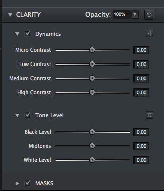
Functionality wise, I can see threes major components: the clarity section, a tool that affects the local contrast based on different contrast areas (very small, small, medium and large contrast parts of the image), the tonal section, a way to control the tonal range of the image by changing black point, white point and mid tones and a HSL section that allows changing the Hue, Saturation and Luminosity either overall or on colour channels (Red, Orange, Yellow, Green, Cyan(Aqua), Blue, Purple, or Magenta). All of these can be applied selectively using the Topaz masking tool, introduced some time ago with other plugins.

Clarity controls are the main feature of this plugin. They provide some nice tools of improving local contrast and being something new in Topaz world, I decided to focus on it.
First of all, let me explain you how it works. Depending on what area of the image it targets (micro, low, medium or high contrast areas), it increases the contrasts only in that particular area. So if the contrast is , for example, between a light green and a dark green, this contrast is enhanced by lighting the light green and darkening the dark green even further. Depending on the contrast between the two tones of green, one or other slider will achieve this effect. But this is different then a global effect as, if same light green tone is sitting next to a pure black, it will be kept untouched by the same slider that was lighting it before. So for example in the below screenshot, if you look at the small line of light green on the building, slightly visible in the left, it gets more prominent when Micro contrast is applied.

Based on the above explanation, Clarity is a very effective way of improving the local contrast of an image, targeting only some particular type of existing contrast.

But don’t over-do it, as too much contrast is not so eyes pleasing:

No halos – in my tests I haven’t notice the very annoying artefact that enhance the poorly executed HDR or HDR like images (if you don’t know what is all about, just try some HDR processing software, move the strength sliders to the max until a lighter area is visible around your buildings, trees or mountains). Everyone got these trying to process HDR or to increase the local contrast of an image beyond some limits. But the local contrast algorithm used by Clarity is pretty nice and the halos are avoided with a success.
Whites get whiter and blacks get blacker – good thing isn’t it, as strong blacks and whites are very good, especially if you are intending a B&W conversion afterwards. No colour degradation can be noticed for the non-neutral colours present in the image. But pay attention when you apply this to the whole image, as some details can be easily lost if you go too far or increase the wrong contrast.

Warning: Micro contrast should be used with care as I noticed that, when pushed at high level, it tends to add quite some large amount of noise. It also produces quite high vignetting as can be seen in the corners of the image in the small preview screen on the right, so I recommend using it with moderation and when really needed (areas with very low contrast where you want to pop it a little bit). And you should know, low contrast is there in a image for some reason, and transforming it into a high contrast area is most of the time totally unrealistic. On a positive note, it is also rather helpful to identify the sensor spots 🙂

I will not spend too much time talking about the Tone Level and HSL Control. They are pretty standard functionality, existing in almost all photo editors. Using Tone level, you can do overall contrast changes to your image. You can make blacks blacker, whites whiter or mid tones lighter or darker. HSL colours control can change the hue of a colour (I can make my water pink if I want 🙂

or can change the saturation or the luminosity of a single colour channel. They work as expected in Clarity plugin and I consider them a nice complementary feature to the clarity enhancements.
Overall Clarity is a helpful tool that combines two major adjustments that can be done to an image: contrast changes and colour changes. That’s what you need for many types of photographs that require just slightly tweaks, no major Photoshop editing. It can be very useful for a beginner photographer that just wants to pop up a bit his images or for a more advanced photographer that looks for the specific contrast changes that Clarity offers. Clarity can be also very useful for HDR guys, that can take advantage of the “no halos” feature when processing further their tone mapped files.


Comments
Post a Comment